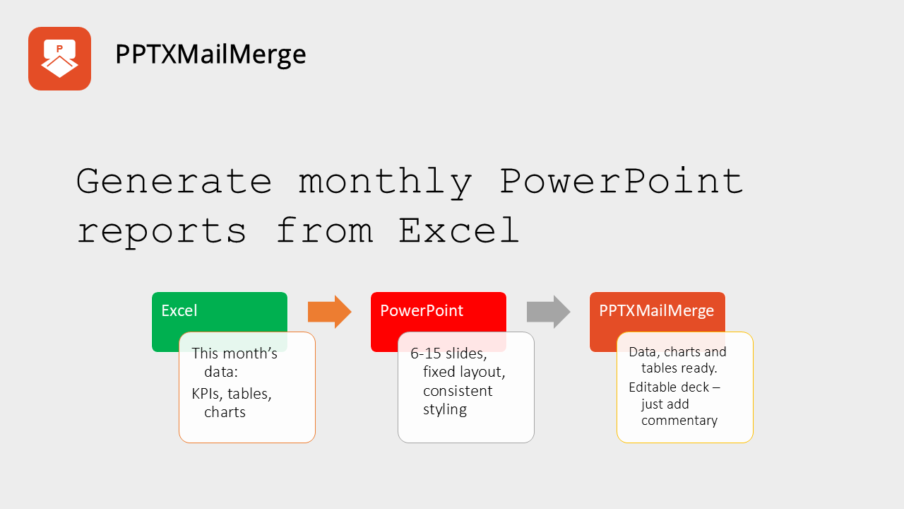
Monthly reporting - the bane of every marketer's existence. The end of month comes and you know what's waiting there for you - several hours of frantic copy-pasting, table formatting, font-size adjustments. "Can't all the data transform itself magically into a PowerPoint deck?" you ask.
You already have last month’s PowerPoint. You already have this month’s Excel. What you want is this month’s version of the deck — not another hour of screenshots, paste, and whatnot.
That is the whole job of a monthly report. The numbers change. The story should stay in the same slides, with the same colours, the same chart types, and the same board-level layout. Most teams still rebuild it by hand.
We feel the pain (we've been there ourselves). We've experienced the frustration of trying to keep the same layout and formatting while updating the data. We've wasted hours making screenshots of analytics from various social media accounts, Google Analytics, CRMs and other sources just to paste them into PowerPoint.
That's why we've created PPTXMailMerge — PowerPoint (reporting) automation tool that generates monthly PowerPoint reports from Excel with ease.
The monthly reporting grind is still copy and paste
For a lot of marketing agencies, freelancers and in-house teams month-end ritual still consists of doing reporting with screenshots, exports, copy/paste workflows and last-minute PDFs every month.
The files are not the problem. The process is.
When the audience is a board or a management team, the friction gets expensive. A typical month looks like this:
- pull source data into Excel,
- build the charts there,
- paste them into a PowerPoint template,
- then spend the better part of an hour chasing alignment, font sizes, and colours that shifted on paste,
- export to PDF,
- do it again next month.
The pack is usually 10–15 slides. Charts do not keep a consistent look from slide to slide. When the workbook updates there is no refresh — you rebuild or re-paste. Keeping styling aligned across the whole deck is manual and easy to get wrong.
The usual Office workarounds do not close the gap. Paste as a picture locks the look and kills refresh. Linking charts back to Excel still lets fonts and colours drift. Power BI is often already in the stack, but it is a poor fit for this job: visual control is too limited for board-level output, and the result is not a PowerPoint or PDF pack you can tidy and send.
None of those paths give you both: refreshable numbers and stable slide design. That is the actual problem — a 10–15 slide monthly cycle that should not start from scratch every time.
A repeatable process saves hours every month
The clean answer is not a cleverer paste. It is a process you can run again next month without redesigning the report.
Do the analysis in Excel. Keep a standardised PowerPoint template for the pack. Generate this month’s deck instead of rebuilding it. Then spend your time on the only part that should stay manual: the commentary.
That split matters if you report for one company. It matters much more for marketing agency reporting. An agency with ten clients, each needing a 10–15 slide monthly report in PowerPoint, is not looking at 45–60 minutes once. It is looking at that cost on every account, every cycle — easily a working day of alignment fixes, chart colours, and last-minute PDFs. A repeatable process turns client reports in PowerPoint into: update the workbook, generate the deck, write conclusions.
Three layers, used the same way every month:
- Automate the pull into Excel. Whatever the sources are — ads platforms, analytics, CRM, finance — land the month in a workbook you trust. Pivot, calculate KPIs, keep named tables for charts. Excel stays the analysis layer.
- Keep one standardised PowerPoint report. Design the board pack once: title, KPI highlights, charts, table, commentary slide. Lock fonts, colours, and chart types in the template. Do not paste charts from Excel onto the slides.
- Generate this month’s version with PPTXMailMerge. Map the Excel named ranges and tables onto placeholders in the template. The output is an editable
.pptxwith this month’s numbers and last month’s layout.
You still pull data. You still think. You stop rebuilding the document.
Sample monthly marketing report
We put together a sample 6–8 slide monthly report in PowerPoint and a matching Excel workbook so you can see the pattern. Download the PowerPoint monthly report template and the Excel data file, inspect the placeholders and named tables, then generate a copy for yourself.
The pack is a management-style marketing report for one company and one month. It is meant to be reused: change the period in Excel, refresh the numbers, generate again.
Slide structure
Title
- Company name
- Date of the meeting where the report will be discussed
- Period (the month the numbers cover)
KPI summary — monthly highlights
Short sentences, not a dashboard dump:
- Total marketing reach grew X% month over month
- Overall website visits up X% from [previous month]
- Generated X new leads in [month], up X% from [previous month]
- Marketing brought in X customers, up X% from [previous month]
- Marketing generated X% of all customers closed
Charts
- Website visits — last month (line chart)
- New customers by source — last month (stacked column chart)
- Customer Acquisition Cost over the last 12 months (line chart)
Table
- Top 15 performing pages — three columns: title, URL and visits
Commentary
- Conclusions, added after generation
The commentary slide is empty on purpose. The merge fills facts. A person still writes what the month means before the pack goes to the board.
What lives in the Excel file
Keep Excel as the single source for the month. A practical layout looks like this:
| Sheet or table | Role |
|---|---|
| Cover / KPIs | Company name, meeting date, period, previous month name, and the highlight numbers (reach growth, visits growth, new leads, new customers, marketing share of closed customers) |
| WebsiteVisits | Named table for the last-month visits line chart (date or day in the first column, visits in the next) |
| CustomersBySource | Named table for the stacked column chart (day or week in the first column, one column per source) |
| ConversionRate12m | Named table for the 12-month conversion line chart |
| CAC12m | Named table for the 12-month Customer Acquisition Cost line chart |
| TopPages | Named table with page title and visits, already limited to the top 15 |
Format chart and table data as Excel tables (Ctrl+T) and give them stable names. Put KPI sentences’ moving parts in named ranges or clearly labelled cells so the template can address them. Press Ctrl+F3 to open Name Manager and check what the workbook exposes.
You can still build exploratory charts in Excel if that helps you analyse. Those Excel charts are not what goes on the slides. The PowerPoint template owns the chart objects; Excel only supplies the series.
Automate as much of the pull as you can — Power Query, exports, a scheduled dump — so “update the month” is refresh-and-check, not rebuild-the-workbook.
What lives in the PowerPoint template
Design the pack once. Placeholders in text boxes take cover fields and KPI values. If those fields sit on a Cover sheet with headers in row 1 and one data row beneath, save the workbook with that sheet active and use simple placeholders, for example:
{{company_name}}{{meeting_date}}{{period}}{{previous_month}}{{reach_mom_pct}}{{visits_mom_pct}}{{new_leads}}{{new_leads_growth_pct}}{{new_customers}}{{new_customers_growth_pct}}{{marketing_share_of_customers}}
If you prefer named ranges instead of a one-row Cover sheet, address them explicitly — for example {{xlsx.KPIs!reach_mom_pct}} — so the merge does not depend on which sheet was active when the file was saved.
Insert native PowerPoint charts (line, stacked column) and style them to the board pack: colours, fonts, axis, legend. Then point each chart at an Excel table via Alt Text, for example:
{{type=chart data=xlsx.Visits!WebsiteVisitsTable}}
{{type=chart data=xlsx.Customers!CustomersBySourceTable}}
{{type=chart data=xlsx.CAC!CACTable}}
The chart type in the template is the chart type in the output. A stacked column stays a stacked column. Colours and fonts stay as you designed them. Data is swapped in; formatting is not rebuilt from an Excel paste.
For the top pages table, insert a two-column table (header row only) and set its Alt Text to:
{{type=table data=xlsx.TopPages!TopPagesTable columns="Page Title, Page URL, Visits"}}
You can give the PowerPoint headers their own labels (Page, Visits) independently of the Excel column names. Details for charts and tables are in the template syntax docs. The same pattern is used in the sales report with charts and tables.
Leave the conclusions slide without merge fields, or with a short placeholder you will replace. That is the slide you edit after the file comes back.
Generate this month’s deck
When the workbook is updated for the period:
- Open the Excel to PowerPoint merge tool.
- Upload the PowerPoint template and the Excel file.
- Under How to process the data, choose Merge data with slides. This is a fixed 6–8 slide pack, not one slide per Excel row. If you leave the default that repeats the template, the engine will try to loop on the first table it finds.
- Generate and download the
.pptx.
You get this month’s numbers in last month’s layout. Charts stay native and styled. The table fills from Excel. Cover and KPI text update from named cells.
Then write the conclusions. Export to PDF if the board wants a PDF. Next month, refresh Excel and generate again. You do not re-paste four charts or walk 10–15 slides fixing font sizes.
If you produce client reports in PowerPoint for several accounts, keep one template (or a branded copy per client) and one workbook per account. Run the merge once per client. That is how marketing agency reporting turns a day of screenshot work into a short generation pass plus commentary.
What this does not try to be
It does not replace your data pipeline. Pulling from source into Excel still has to be reliable — automate that separately. But you don't need to automate the data pull all by yourself. You can checkout the following (we are not affiliated with them, but they solve the data pull of automating the monthly reporting process). Depending on your needs you might explore the following tools:
| Need | Example tool | Output |
|---|---|---|
| GA4 only | Google GA Reports Builder | Google Sheets |
| Multiple ad/analytics platforms | Supermetrics | Google Sheets / reporting tools |
| Multi-source marketing data | Coupler.io | Google Sheets / Excel / BI |
| Excel-centric workflow | Windsor.ai | Excel / Google Sheets |
It does not write the narrative. Refreshable charts and a stable template get you a board-ready document; someone still has to say what changed and what you will do next.
It is not Power BI. If the audience needs to explore a dataset, use BI. If they need a 10–15 slide pack with controlled typography, your colours, and a PDF they can forward, keep PowerPoint and stop fighting paste.
Start from the sample
Download the sample monthly report PowerPoint template and sample Excel data file, generate a pack in the xlsx2pptx tool, then swap in your own company, period, and tables.
Having this initial process and setup in place, will let you focus on the content of the report, rather than the process of creating it.